2010年9月15日星期三

week6: the ancient art of rhetoric and persuasion


"We saw in what sense text can help anchor a picture, that is, contribute toward its presumably intended interpretation. But it is not merely linguistic information that helps anchor elements in pictures; often that role is played by information in the same medium- that is by other pictorial elements. "(Charles Forceville,1996,75) During the journey of learning visual communication, I come to realize that sometimes pictures are much more powerful than words.
  
One of Gail Tom and Anmarie Eves's(1999) findings indicate that "advertisements that use rhetorical figures result in superior recall and superior persuasion." I find it true when I was doing some research about this visual journal. We learned "seeing and perception" in the previous chapter and know that everyone has their own interpretation of a picture. Therefore, it will be more effective if the advertiser let the customers come out the idea themselves. 
 Figure 1
Look at this ad. Enthymeme is employed in it. When people see it at the first sight, they’ll focus on the right part because: 1.People usually see things from left to right.  2. Something is usual there. A shoe is put in the place where we usually put the tie.

Then we look at the right part. We can see there are 3 shoes and it’s obvious that one shoe is missing. The hidden message of this ad is that the Clerget shoes are so beautiful. They will be unnoticeable if people just wear them on the feet. They would rather show them to others like how they show their tie. ( Is it a bit weird?)


Figure 2
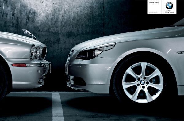
Look at the figure 2. There 2 points that make us focus on the jaguar of the left car.
  • The background is dark and the cars are silver. Therefore, the cars stand out from the dark background.
  • The trademark jaguar is different from what we used to see before and therefore attract our attention
 The ad shows that the jaguar is face-off in fear from the BMW because it's too powerful. The enthymeme in this ad is that BMW is superior than any other brand. It's consumers' best choice. The rhetoric lies in it simulate consumers to buy its car because of BMW's superiority.
In conclusion, rhetoric and persuasion are vital in the advertisement. They help to deliver the message in a completely different way, which can create more reader response. 
References:
1.Forceville,C.(1996),Pictorial Metaphor in Advertising. Britain:Routledge.pp.75
2.Tom,G.& Eves,A. (1999), The use of rhetorical devices of advertising.Journal of Advertising Research.39-43


week5:Gestalt Effects and Schema Theories

Gestalt Theory:

Max Wertheimer, together with his two colleagues Kurt Koffka and Wolfgang Köhler established Gestalt psychology. The core of Gestalt theory can be expressed in this way. "There are wholes, the behaviour of which is not determined by that of their individual elements, but where the part-processes are themselves determined by the intrinsic nature of the whole."(Max Wertheimer,1944,4)

Figure 1
For my own standing, what Gestalt theory tells me is that we should view things as a whole instead of isolated individual.

Figure 1 can be a illustration of gestalt theory. According to the law of similarity, “the brain can more easily group similar shapes, sizes, colors and the like than dissimilar graphic elements”(Paul Martin Lester,2005,51) In figure 1, the soda cartons of same color are put together to create certain elements. As I mentioned above, gestalt psychology maintains that “the whole is different from the sum of its parts.” It can also be applied to analyze this image. In figure 1, the sum of the soda cartons are perhaps—100 cartons of soft drink. But if we see it as a whole, the meaning of figure 1 is clear—it’s Mario’s figure. The display is creative that it can catch customers' attention immediately. If you just focus on the individual instead of the whole, you can't no understand intention of the display designer.

Schema Theory
Schema theory is another theory which visual communication professions find important in visual communication.  Diane H. Tracey and Lesley Mandel Morrow indicates that schema theory in general strives to "explain how knowlege is created and used by learners."(Diane H. Tracey,Lesley Mandel Morrow,2006,51)

Figure 1
When speaking of juice package design, people's schemas for it may be seen in figure 1. However, figure2 is another package design which is quite different from people's usual schemas for package design.
Figure 2(by Naoto Fukasawa)
                                 
Top general level frame:the package of the juice
Lower level has terminal that can change.In figure 2,Naoto changed the traditional design of juice drink package. Instead, he designed the package closely mimic the shape and texture of the fruit they contain. By using the bionic design, the juice arouse consumers' desire to buy.
This package design is an good example of  schema incongruity.Mark A.Callister and Lesa A.Stern note that "a consumer may judge a given visual image as both congruent and incongruent depending on the schema applied."(Mark A.Callister and Lesa A.Stern,2007,139) In this case, the visual image is different from the consumer's usual schema. Therefore, it may catches consumers' eye as soon as they see it because it's something that completely new to them. By using this bionic design, the designer succeeds in arousing consumers' desire to buying the juice.

2. Lester,P.M.,(2005).Visual communication:images with messages.(4th edition).USA: Thomson Wadsworth.pp.51
4.Callister,M.A and Stern L,A.(2007).Inspecting the Unexpected:Schema and the Processing of Visual Deviations.Go Figure! New direction in Advertising Rhetoric(pp.139).Armonk:M.E Sharp.Retrieved September 15,2010,from http://books.google.com.hk/books?id=Kgbop325kA0C&pg=PA139&dq=Schema+incongruity&hl=zh-CN&ei=TyfUTP30C8e2cduEjPwE&sa=X&oi=book_result&ct=result&resnum=1&ved=0CCoQ6AEwAA#v=onepage&q=Schema%20incongruity&f=false

2010年9月13日星期一

week4:visual syntax,semantics and pragmatics

There are 3 branches in Linguistics: semantics, syntactics and pragmatics. C W Morris (cited in Daniel Chandler,2005) gives a clear definition: "
  • Semantics: the relationship of signs to what they stand for;
  • syntactics:the formal or structure relations between signs;
  • pragmatics:the relation of signs to interpretations ".
Images can be a language as well. If we applied these 3 branches in images, it can explain how images are constructed, given meanings and how they manage to communicate with the readers.

For example, figure 1 is the logo of the brad MUJI. Its syntactic structure is very simple.Its background is dark red and words are written in white. This strong comparison makes the name of the brand stand out from the background. The logo designer use the simpleast font for the words "MUJI". However, these may mean nothing to you unless you know what the signs stand for and its brand culture.

Muji is a Japanese retail company, which is famous for his high-quality household and consumer goods. Muji is also distinguished by minimalist design, focusing on recycling, less advertising, and no-logo or “no-brand” policy. Muji developed a no-brand strategy, which means it puts less money on advertising or traditional marketing. Even when they advertise, they concentrate on the philosophy 'minimalism'. Therefore, its logo is the reflection of MUJI's philosophy.


                                                                           figure 1
 Figure 2 and Figure 3 is a set of advertisements of MUJI designed by Kenya Hara, which also shows Muji's philosophy.Its syntatic structure is very simple as well:
  • The horizontal line gives us the impression of depth.
  •  Light blue in these 2 ads mixed with white next to each other produces unpleasing sight, which catches people's eyes.
  •  Hara used few colors in the ads and the colours he used are very pure,which suggests simplicity.

                                                                           figure 2
 figure 3

Patrick Griffiths notes that "If expressions did not have denotations, language would hardly be of much use. It is the fact that they allow us to communicate about the world that makes them almost indispensable"(Patrick Griffiths, 2006,11) Likewise, if expressions in a advertisement did not have denotation, it would be an uneffecitve advertisement. The syntax of figure 2 and 3 are meaningless unless they are given meanings in it.


By carefully constructing the elements of lines and colors, Hara relates the syntax to the semantic meanings.Hara succeeds in expressing simplicity instead of emptiness in them by using the least elements in these advertisements. The advertisements try to tell readers that the products of MUJI are like these ads: No necessary ornamental objects need to be added. By using the simple syntax, MUJI's brand moral is shapen. What's more, the syntax makes it speak out: simple is the best.


Reference:
1. Chandler, D.(2005).Semiotics for beginners.Retrieved September 13,2010 from http://www.aber.ac.uk/media/Documents/S4B/semiotic.html
2. Griffiths,P.(2006).Introduction to English Semantics and Pragmatics.Edinburgh:Edinburgh University Press.pp.11

2010年9月11日星期六

Semiotics: the study of signs

week3:Semiotics


Semiotics in Propaganda posters of China Cultural Revolution
Semiotics is a widely used in different mediums because it is a very good way for the text to be interpreted and understood. According to Robert Scholes(1982:15), “As a text, however, a piece of writing must be understood as the product of a person or persons, at a given point in human history, in a given form of discourse, taking its meanings from the interpretive gestures of individual readers using the grammatical, sematic, and cultural codes available to them.” Likewise, semiotics can be employed in images as well. Roland Barthes (cited in Stokes, Janes, 2003:73) states 7 stages in a semiotics analysis, which I find it is very useful. The stages are “Define your object of analysis, gather the texts, describe the texts, interpret the texts, draw out the culture codes, make generalizations and make conclusion. Following this process, we can conduct a semiotic analysis logically.

There was a cultural revolution in China in 1970s. At that time, the society is overwhelmed with Maoism. It could be reflected in propaganda posters.


Figure 1
Figure 1 is the object I’m going to analyze. It is a propaganda posters at that time.
Signs: Chairman Mao,people who come from different countries and the sun.
Denotation: At sunrise, People who come from different countries gather together. They are holding the Red Book happily and Chairman Mao is smiling to them.

The syntax of this ad is very interesting. Chairman is placed in the middle and a huge sun is behind him, which makes him outstanding in the whole image. As you can also notice, the size of Chairman Mao’s figure is 10 times bigger that the figures of civilians. Therefore, the position of and the size of the sign in this image connotes that Chairman Mao is respectable and his leadership cannot be replaced by anyone else. The sign of the rising sun connotes that the leadership of Chairman Mao may bring us a bright future. What’s more, the slogan “毛主席是世界革命人民心中最红最红的太阳”(meaning: Chairman Mao is the reddest sun in people’s heart.) accompanying the image makes this propaganda ad more expressive.
However, if you don’t understand the cultural codes at that time, you may no know what I’m talking about. Chairman Mao is a very respectable leader in China. He made great contribution to China’s independence. People who suffered a lot before independence were all grateful to him. Maoism had become the mainstream ideology at that time and people were even crazy about it. They believed everything what Chairman Mao said and do everything Chairman Mao suggested to do. That’s why in this ad, the figure in this ad is much larger than others and is placed in the centre. This kind of political propaganda posters is a good tool for Chairman Mao to propagandize Maoism among civilians and enhance his leadership in China at that time.

References:
1.      Robert S.(1982).Semiotics and Interpretation. New Haven and London: Yale University Press.pp.15
2.      Stokes,J.(2003).Semiotics.How to do media and culture studies. London:Publications.pp.70-73

week2:seeing and perception


There is a saying that “Seeing is believing”. But has it ever occurred to you that sometimes what you see is not always true? I find it interesting that we are sometimes blinded by our eyes. During my journey of learning visual communication, I come to realize that everyone has their own perception of what they see.  Ozgonul Aksoy indicates that "our understanding of the world is dependent on our culture, society and on the education systems and other aspects of a given society as well as on the characteristics of our perceptual process"(cited in Tasso Borbe, 1983,1423) Our perception towards the same thing can be completely different if we come from different culture. Therefore, when we analyze our interpretation towards a text, we must take cultural context into consideration.


 Color processing in the brain occurs hand in hand with processing of other properties, such as shape and boundary. In our decade-long attempt to discern how color influences perceptions of other properties in objects, we have considered a number of novel illusions, many created by us.”(Werner, John S. and Pinna, Baingio and Spillmann, Lothar , 2007) For example, when seeing the ‘red color’, what comes to your mind first?
Danger? Excitement? Courage ? Or …? For me, what comes to my mind first is good fortune. In China, red means good fortune. Therefore, married couple always give the youngs lucky money in red envelop.


What about green?

Green reminds me of enviromental protection, nature, growth and so on. But if a Bruneian kid see the green color now(during the hari raya), he may think about the green envelope he receive these days. Because Malay Muslim hand out money in green envelopes to their guests who visit their homes during Hari Raya Aidilfitri. The reason behind the green colour is simply its association with the Islamic paradise.


Do you like the yellow color? Yellow is one of my favourite colors. I think it represents energy, sunshine and bright future. I was a bit upset when I was told that civilian were not allowed to wear yellow clothes especially in the palace. Yellow symbolize the royalty in Brunei, therefore wearing yellow clothes is considered inappropriate.


Color plays a vitally important role in the world in which we live. As a powerful form of visual communication, color is irreplaceable. After analysing these 3 colors, I am surprised to see that how differently we interprete the color due to the cultural background. But there isn't right or wrong in the understanding of the colors. People have their own right to interpret what they see according to their experience, culture, belief,habit and so on.


Reference:
1. Werner, John S.,Pinna, Baingio, Spillmann & Lothar (2007) Illusory color and the brain: novel illusions suggest that the brain does not separate perception of color from perception of form and depth. Scientific American Magazine, Vol. 296 (3), p. 90-95. Article.
2.Tasso Borbe.(1983).Semiotics Unfolding.Vol.3. Berlin:Mouton Publishers.pp.1423